Merge lp:~wallyworld/launchpad/link-bugs-in-merge-proposal into lp:launchpad
| Status: | Merged |
|---|---|
| Approved by: | Ian Booth |
| Approved revision: | no longer in the source branch. |
| Merged at revision: | 11563 |
| Proposed branch: | lp:~wallyworld/launchpad/link-bugs-in-merge-proposal |
| Merge into: | lp:launchpad |
| Diff against target: |
94 lines (+29/-31) 2 files modified
lib/lp/code/stories/branches/xx-branchmergeproposals.txt (+0/-1) lib/lp/code/templates/branchmergeproposal-index.pt (+29/-30) |
| To merge this branch: | bzr merge lp:~wallyworld/launchpad/link-bugs-in-merge-proposal |
| Related bugs: |
| Reviewer | Review Type | Date Requested | Status |
|---|---|---|---|
| Tim Penhey (community) | Approve | ||
| Ian Booth (community) | ui | Approve | |
| Paul Hummer (community) | Approve | ||
|
Review via email:
|
|||
Commit message
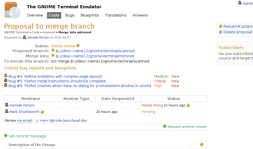
Move the linked bugs section on the branch merge proposal page to be just below the branch summary section, above the review comments.
Description of the change
Move the linked bugs section on the branch merge proposal page to be just below the branch summary section, above the review comments. I looked at putting the linked bugs in the unused space to the right of the branch summary details but this caused the branch and bug links in both sections to wrap. I added some horizontal white space just above the newly placed linked bugs section to make the page look better. The white space was added by wrapping the linked bugs div inside a <div class="first"> but I'm expecting there may be a better way - if so, I'll change it.
Tests:
- no changes or new tests required.
- ran the doc and windmill and unit tests for "branchmergepro
"

Screenshot of new merge proposal screen:
https:/